Why Mobile-First Commerce Needs Different Payment Design
Shopping on a phone isn't just a smaller version of desktop buying. It demands fresh thinking in payment design. From app stores to digital content platforms, the rise of mobile-first commerce challenges how payments happen. In this post, we’ll explore why design for payments must change on smaller screens to ensure quick interactions, reduce abandoned carts, and embrace new payment methods beyond cards.
Faster Checkout Means Fewer Abandoned Carts
Cart abandonment is a huge problem. When the checkout feels slow, confusing, or clunky, users drop off. This hurts revenue whether you sell physical goods or subscriptions in app stores.
Mobile checkout needs to be lightning quick. But what does “quick” mean here? It means minimizing taps and waiting times. Every extra form field or page increases friction. Take Apple Pay and Google Pay for example. They show how removing typing speeds things up:
- Apple Pay leverages biometric authentication, like Face ID, to confirm payments instantly.
- Google Pay auto-fills card info from the user’s account and then requests just a tap.
The main takeaway? Let users tap once or twice and move on. Don’t ask for unnecessary info on small screens. That’s why many successful mobile-first platforms embed these wallets as primary payment choices.
What Does the User Tap Next?
Always design by asking this crucial question: “What does the user tap next?” The flow must have a clear, simple tap after confirming the cart or content selection. If users must hunt for a button or scroll through long forms on a screen barely bigger than a credit card, they will abandon.
Shifting From Cards to Alternative Payments
The world is moving beyond plastic cards. Mobile-first commerce demands alternative payment options that fit quick interactions on tiny screens.
Why? Cards mean typing numbers, expiration dates, and CVVs. This is tedious on mobile keyboards. Meanwhile, alternative payments like mobile wallets or legacystance.com direct carrier billing simplify the experience.
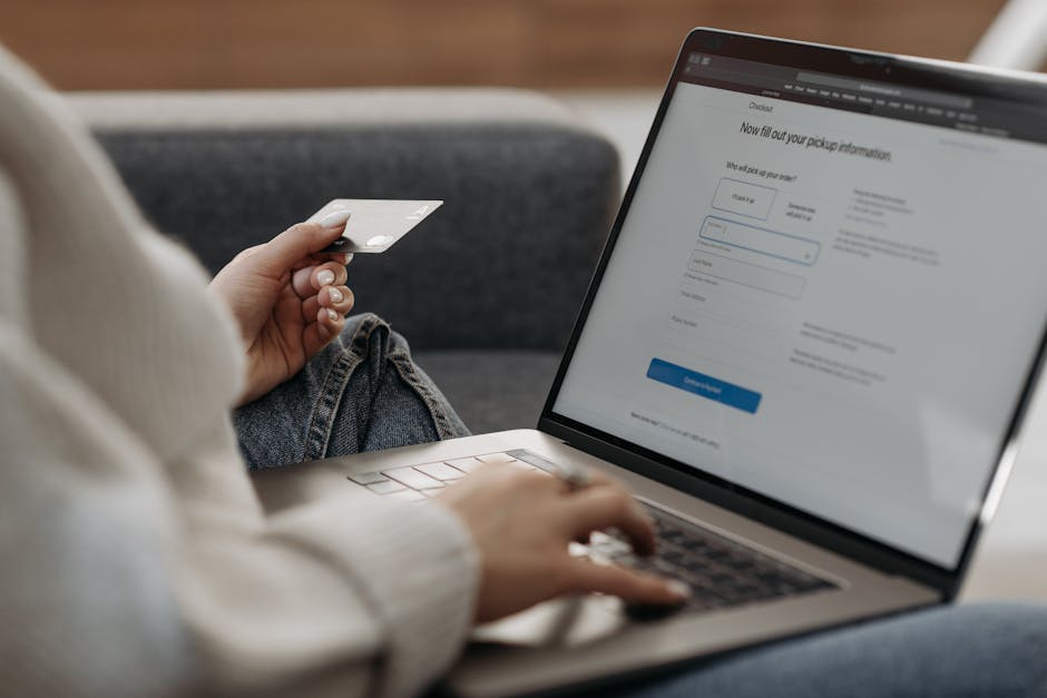
According to the GSMA, direct carrier billing (DCB) is on the rise. It lets users charge purchases directly to their phone bills. This is perfect for prepaid users or those wary of sharing card data online.
- Mobile wallets like Apple Pay and Google Pay use tokenization to protect card details. Users don’t enter card numbers with tiny thumbs.
- Direct carrier billing works by linking purchases to your phone number and approved by your carrier’s backend.
- Some platforms also support local wallets or bank transfers optimized for mobile-first users.
This flexibility across payment types lowers friction. Users pick a method that suits them without hunting for a physical card.
Security Without the Marketing Fluff
Security is important, but don’t settle for vague claims like “safe and secure payments.” Say exactly what data is shared or kept private. For example:
- Apple Pay never shares card numbers with merchants.
- Direct carrier billing passes minimal data—usually something like phone number and transaction ID—to the carrier.
- Neither exposes your CVV or full card number during payment.
Design payments to reassure by showing what’s protected. Avoid jargon. Clear language builds trust and reduces hesitation on mobile devices.

How Direct Carrier Billing Works
Let’s break down DCB’s key steps for a mobile-first checkout:
- User selects digital content or service in the app store or platform.
- The payment screen offers “Pay with Mobile Carrier” as an option.
- User taps that option and confirms via a minimal prompt.
- The carrier receives a billing request behind the scenes and verifies the user’s account.
- Once carrier approval arrives, the charge shows on the phone bill or is deducted from prepaid balance.
- Purchase confirmation is shown instantly on the small screen.
Notice we never ask the user to type card info. Instead, the billing integration happens server-to-server with appropriate approval steps from the carrier. This avoids overpromising "instant" payments without mentioning carrier checks—an important realism check.
Why DCB Excels on Small Screens
DCB is ideal for mobile-first commerce because it uses what’s already on the phone:
- Phone number as payment ID
- Carrier-approved billing relationship
- No complex form entry
- Works even if user lacks a credit card
This dramatically reduces abandoned carts, especially for subscriptions or digital content in app stores and platforms that must target mobile users worldwide.
Mobile-First UX Means Design for Small Screens and Quick Interactions
Designing payment flows for smaller screens isn’t about shrinking desktop layouts. It’s a fresh art. Here’s what matters:
- Minimal input: Use autofill or tokenized solutions like Apple Pay and Google Pay.
- Clear calls to action: Large tap targets labeled precisely.
- One-step confirmation: Confirm payment with just a tap or biometric sign-in.
- Progress indicators: Show approval status fast, especially for carrier billing waits.
- Context-aware design: For example, disable fields that are irrelevant or pre-fill info when possible.
- Accessibility: Consider screen readers and reachability of buttons on big phones held with one hand.
Takeaways From Leading Mobile Commerce Platforms
Company Payment Feature Mobile UX Benefit Apple Pay Biometric payment confirmation, tokenized card data One-tap checkout, no form typing, strong privacy signals Google Pay Auto-fill saved cards, multiple payment options in one UI Less typing, quicker method selection, cross-platform consistency GSMA & Telcos Direct carrier billing, mobile billing integration No card info needed, works on low-credit users, reduces frictionConclusion
Mobile-first commerce demands payment designs tailored for smaller screens and quick interactions. Faster checkout reduces abandoned carts. Users want alternatives to typing long card details — hence the rise of Apple Pay, Google Pay, and direct carrier billing backed by the GSMA. Each approach simplifies checkout in key ways:
- Leveraging biometrics or tokenization to avoid typing
- Using phone numbers and carrier billing for frictionless charges
- Applying small-screen UX principles to minimize taps and confusion
As commerce continues shifting mobile, payment designers must rethink flows from the ground up. Focus on what the user taps next. Be transparent on what’s shared and what’s protected. And most importantly, design payments that feel as fast and easy as scrolling through a favorite app.